Subscriber Special - 2020 House primaries and presidential vote share
Due to some last-minute data cleaning for some of the presidential primary calculations in this piece, as well as a third allegation of sexual harassment against Andrew Cuomo, this is coming out later than we’d have liked.
Hi, this is Opinion Haver. I’m doing this one alone because Nick has deep personal convictions about never having to touch statistics again after high school. Also because the premise was my idea. (EDIT: Nick did help proofread and revise this before it went out. He also typed this little note.)
Fair warning, this one’s going to have a lot of charts. Specifically scatterplots.
See, the question I wanted to answer was “How much did the coalitions who voted for congressional primary challengers resemble the coalition that voted for Bernie Sanders?”. My purpose here is not to re-litigate the presidential primary yet again, but rather to probe some questions about how much of the 2020 primary was a result of a more fundamental ideological and tactical stance of voters, and more directly, how much the downballot behavior of voters is predicted by their presidential choice. I took a relatively simple route to answering that question: a regression analysis. Skip the next two paragraphs if you remember high school stats.
What that means is taking I’m two sets of data points and comparing them to see how they relate to each other. For example, if you were to compare the cost of a TV and how big it is, you’d probably find that TVs that cost more tend to be larger. Conversely, if you compare the cost of a soda with the number of words on its label, you’re not going to find that a soda that costs more has more or less words on it. I think that’s covered in most middle or high school math classes, but there’s no shame if you needed a refresher. Specifically, I’m comparing the proportion of Democratic voters in a given precinct who voted for Bernie Sanders with the proportion of Democratic voters in that precinct who voted for a congressional primary challenger.
I’m doing a basic regression analysis to obtain a correlation coefficient, aka an r-value. It’s a numerical measure of the relationship between two values. Positive means that as Bernie’s vote share increases, so does the challenger’s vote share, negative means the opposite, and 0 means no relationship. Importantly, when you square it, you get the proportion of the variation in the challenger’s vote share that’s explainable by Bernie’s vote share. This does not mean that if the value is, for instance, R2 = .5 = 50%, then 50% of Bernie’s voters voted for the challenger, or that 50% of the challenger’s voters were Bernie voters. It means that if you look at the variation in how the challenger did—they did well in some precincts, but not so well in others—half of that variation is explainable, aka “predicted”, by how well Bernie did in those precincts.
I decided to limit myself to the races where a challenger got somewhat close to winning. This was both because I didn’t want to do dozens of races, but also because the goal here is to learn something, and if a challenger loses 80-20, that race was obviously not close to succeeding, and the value that can be applied to a successful race is limited. So, I decided to look at the 10 closest elections. I also made a methodological decision to not concern myself with precinct size. There are ways to measure correlations where each point is weighted in importance, but I opted not to pursue that. I did, however, throw out any precincts with fewer than 20 votes. It’s a bit of an arbitrary number, but I had to pick a cutoff so that precincts with just a few votes didn’t throw things off. Though I did weight them by size on the scatterplots I made. Now let’s get cracking and look at the 10 best primary challenger performances...
#1: NY-16
Jamaal Bowman 55.4%, Eliot Engel (i) 40.6%, others 4.1%
Biden 79.2%, Bernie 11.9%, Warren 3.3%, others 5.6%
R2 = .09
This is basically uncorrelated. Visually, a dozen or so small outliers make it look like there’s a correlation, but the reality is that there’s nothing there. We’re working in the social sciences here, where much lower correlation values are significant, but .09 is barely removed from random noise. It’s worth noting that Jamaal Bowman blew every other primary challenger out of the water by getting 55% of the vote. No one else even got a majority. Meanwhile, New York’s presidential primary happened in June, so Bernie’s vote share was pretty low. It’s possible that an earlier primary, where Bernie did better, might lead to more useful results. But maybe not. There were a few places where Bernie did relatively well. In the Bronx portion of the district, Bernie’s best neighborhood was Woodlawn Heights, an Irish area that used to be super into the IRA. Bernie got 25% of the vote there, but Bowman got 55%, totally average. Jamaal Bowman was a fantastic candidate, Eliot Engel collapsed spectacularly, and it looks like voting in this race simply didn’t have anything to do with presidential opinions.
#2: MO-01
Cori Bush 48.5%, Lacy Clay (i) 45.6%, others 5.9%
Biden 60.4%, Bernie 34.4%, Warren 1.4%, others 3.8%
R2 = .44
Bingo. Take a look at that, isn’t it nice? It’s a little messy, especially towards the high end of Bush/Bernie vote share, but in terms of election data, this is downright clean and slick-looking. This is made even more impressive by the fact that the congressional primary was held months after the presidential. There was a trend that held up strongly enough that a swap in electorates (from the high-turnout presidential primary to the lower-turnout House race) doesn’t get rid of it. Impressive, huh? I didn’t put a trend line on NY-16’s graph, because it feels irresponsible to do that when there’s no actual trend, but we have one here.
Since we have a decent correlation, a very—and I do mean very—sloppy estimation we could do here is to look at the intercepts. If we extrapolate a Bernie vote share of 1.0, the trend line would hit around .8. So that means a hypothetical precinct of just Bernie voters would vote 80% for Bush, and therefore a reasonable estimation of Bernie supporters voting for Bush is ~80%. Conversely, a 0.0 Bernie precinct gets about a .31 Bush vote share, meaning we can estimate about 31% of non-Bernie voters went for Bush. A quick sanity check, where I plug those estimates back in to the overall Bernie and non-Bernie share of the electorate says that: .344*.8+.666*.31 = .482 = 48.2%, damn close to Bush’s actual vote share of 48.5%.
#3: IL-03
Marie Newman 47.3%, Dan Lipinski (i) 44.7%, others 8.0%
Biden 50.1%, Bernie 43.1%, Warren 1.1%, others 5.6%
R2 = .03
Much like NY-16, this is a totally uncorrelated election. Bernie and Newman got about the same number of votes, which means that this isn’t like NY-16 where a low total for one candidate might be making statistical noise more important, This is a hotly contested race on both sides where the Biden, Bernie, Newman, and Lipinski voter pools are all roughly equal in size. And somehow there’s no indication that voting for one candidate made you more or less likely to vote for a particular choice in the other race. This is a change from 2018, when support for Bernie 2016 was actually correlated with support for Lipinski 2018. Since then, Newman improved significantly in Chicago, and Bernie lost some of the more culturally conservative voters who were backing him as a Clinton alternative.
#4: NY-12
Carolyn Maloney (i) 42.7%, Suraj Patel 39.3%, Lauren Ashcraft 13.6%, Peter Harrison 4.2%
Biden 65.2%, Bernie 20.4%, Warren 8.6%, others 5.8%
I may or may not have lost my mind and made too many graphs for this one. Trust me though, it’s worth it.
R2 = .36
Okay, let’s start here. The correlation isn’t bad, but visually it looks wrong, nonlinear. At low Bernie vote shares, an increase in Bernie vote share correlates with an increase in Patel’s vote share, but this tops out around 15% or so. Maybe there’s an explanation for this. Patel was the leading challenger for Maloney, but for a variety of reasons the left never really warmed up to him. You know who was a lot more liked by local activists? Lauren Ashcraft. Let’s see what her results look like lined up to Bernie’s.
R2 = .74
Oh hello. A coefficient of determination of .74? That’s amazing. That’s the kind of result you expect from comparing general election results. I mean, just look at it. But what about that other candidate in the race, Peter Harrison? He was also running as a leftist; maybe his support also followed this pattern. He only got 4%, which isn’t much, but maybe if you add it in with Ashcraft to get a combined leftist vote share…
R2 = .78
I’m going to be honest, this is the graph that made me decide to write this article. It’s a beauty. I mean this, this right here, speaks very strongly to the idea that there are very real political differences between the areas where Bernie did well and did poorly after he dropped out. Those differences aren’t always relevant—see NY-16 above—but they can be easily brought out.
What if it’s not just Bernie voters, though? Warren got 8%, so those results are also too low to run by themselves, but what if we combine them with Bernie to get a sort of “left protest voter” pool?
R2 = .81
Amazing.
#5: TX-28
Henry Cuellar (i) 51.8%, Jessica Cisneros 48.2%
Bernie 35.94%, Biden 27.20%, Warren 11.77%, others 25.1%
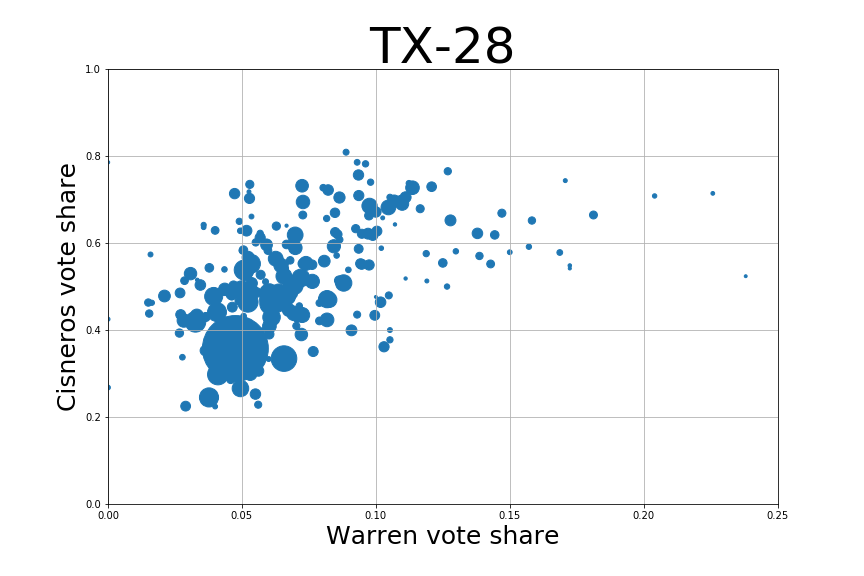
R2 = .03
Before continuing, I should point out that I couldn’t find Starr County’s precinct results, so I entered it as one large data point. At any rate, this looks totally random. Like NY-16 and IL-03, I didn’t include a trendline because there really isn’t any trend. It’s pretty much the same for Warren:
R2 = .19
I’ve tightened the x-axis because Warren didn’t get over 25% of the vote share in any precinct. That’s something to remember here—she barely got in the double digits here. Visually it kind of looks like a trend here, but the actual coefficient of determination is low enough that I don’t think any meaningful relationship is displayed here.
We now have a bit of a mystery on our hands for why one of the most starkly ideological House primaries seems to have little, if any, relationship with the presidential election. My best guess is that Bernie’s campaign was truly, uniquely talented at reaching out to Latino voters, and that expanded far beyond ideology or even age.
#6: TN-05
At this point the ordering breaks down a little. There were a couple of close top 2 runoffs in California, but I’m not including them because the electorate is pretty different in a general and March primary. I’m also not including AZ-01, which is the actual sixth-closest race, because of a much different reason: I couldn’t get my hands on the precinct results.
Jim Cooper (i) 57.1%, Keeda Haynes 39.9%, others 3.0%
Biden 35.6%, Bernie 27.5%, Warren 15.6%, others 22.3%
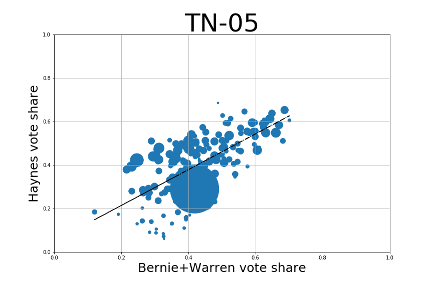
R2 = .36
The first thing you probably noticed about this is that one big point. That’s Davidson County (Nashville) absentees, which was about ¼ of the total votes in the district in the August primary. It was about 1% of the vote in the March presidential primary, which means that a lot of the vote from that contest moved to a different precinct between races. Proceed with caution, in other words. Regardless, .36 isn’t bad. It’s not good, but it’s not bad either. It’s clear there’s something there, but the fit is loose, even without that giant absentee asterisk staring us in the face. Like Texas, Tennessee was a Super Tuesday state and Warren got into the double digits here, so let’s check that out.
R2 = .20
This is riding the line for what can really be called a correlation. Warren only broke 30% in a single precinct, so, much like Bernie in NY-16, the natural statistical noise in something like this may be obscuring any relationship. Or maybe not. Regardless, let’s look at Bernie and Warren combined.
R2 = .43
Well, once again, adding Warren and Bernie’s votes together gives us a better picture of where potential progressive primary voters are than analyzing either separately. Places with a high combined Bernie and Warren vote share tended to vote strongly for Haynes, while places with a low combined vote share had a much higher spread.
#7: MA-01
Richard Neal (i) 58.6%, Alex Morse 41.2%
Biden 35.2%, Bernie 30.6%, Warren 17.1%, others 17.0%
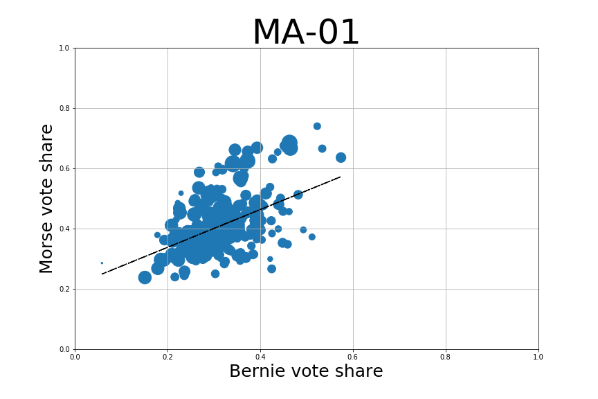
R2 = .23
This isn’t a particularly strong relationship, though it is important to remember that almost 6 months passed between these elections. Interestingly, you can kind of see that the strength of the relationship was dragged down considerably by a handful of precincts in the bottom right, where Bernie broke 40% but Morse didn’t. I checked, and they’re all in Springfield.
You know what’s cool about Massachusetts? It was a super Tuesday state, so Warren was still getting a lot of the vote, and we can check how her voters compare to Morse’s. Let’s do that.
R2 = .35
That’s interesting, and something we really haven’t seen before. Warren’s vote share is more correlated with Morse’s than Bernie’s is. The slope is considerably more positive too. Hey let’s take a look at those outliers in the top left corner, where Morse did fantastically but Warren couldn’t even break 20%. There are 6 of them, and 5 are in Holyoke. That’s interesting, since if you go back to the Bernie/Morse comparison, you can see a band of precincts on the top of the graph that Morse did very well in. Most were disproportionate to Bernie’s vote share. In fact, the only ones that Bernie really kept up in were in Holyoke. Interesting bit of symmetry there, and a nice hint of what’s to come when I make one last scatter plot for this race, using the combined vote shares of Bernie and Warren.
R2 = .63
Now that is satisfying. When you combine Bernie’s and Warren’s voters, you get a fairly coherent picture of Morse’s voters, something that neither presidential coalition was able to provide by itself. Isn’t that encouraging? In MA-01, Bernie and Warren each appealed to distinct groups of voters, and while each group clearly had something to do with predicting Morse’s support, it’s not until you combine them into a unified coalition that you really see results. Almost makes you hopeful for the ability to combine these voting groups in the future, since Morse was able to, even if he eventually lost.
#8: IL-11
Bill Foster (i) 58.7%, Rachel Ventura 41.3%
Bernie 37.9%, Biden 58.0%, Warren 1.2%, others 2.9%
R2 = .19
Will County Board Member Rachel Ventura finishing at over 40% was one of the biggest surprises of the year. Her campaign had been extremely low-key and local. Some of the first indications that this was a race to watch came from incumbent Bill Foster freaking out a couple weeks before the election and calling in every endorsement he could. Some time after the race, I spoke to Ventura about her strategy, and she mentioned that she’d been attempting to target Bernie voters, which is why this graph surprises me so much. There is a weakly positive correlation here, but really it looks like her voters were their own thing, coalition-wise. This might partly be attributable to a home-field advantage in Will County that Bernie didn’t have, but then again, half of her top 10 precincts were in DuPage County. So, I dunno. That’s the conclusion here: I dunno. Politics can be hard to fit into a tidy narrative sometimes.
#9: MN-05
Ilhan Omar (i) 58.2%, Antone Melton-Meaux 38.5%, others 3.3%
Bernie 38.3%, Warren 28.8%, Biden 22.4%, others 10.6%
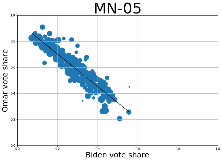
R2 = .72
While this list has mostly been progressive challengers so far, Antone Melton-Meaux’s campaign from the right was still the 10th closest result. Still, I’m comparing Bernie with Omar’s vote share instead of his here. The result is a pretty striking image. Omar voters looked a whole lot like Bernie voters, even if there were a lot more of them.
R2 = .08
Meanwhile, a comparison to Warren voters shows pretty much no relationship between their bases of support. A really weird thing about Warren’s support is that it’s very geographically spread out. She got nearly 30% of the vote, but didn’t crack 40% in any precinct. Still, the level of Warren support in a precinct seems unrelated to the level of support for Omar. Hmm. Who was supporting Antone Melton-Meaux then?
R2 = .81
R2 = .86
Ah.
#10: CA-16
Jim Costa (i) 57.9%, Esmeralda Soria 33.0%, others 9.1% (of the vote for Democratic candidates)
Bernie 40.9%, Biden 26.2%, Warren 7.2%, others 25.7%
This is an open primary. I threw out a couple general elections because there were literally twice as many voters for the general as for the presidential primary, and that’s just untenable. In this case we have 58,830 presidential primary voters, and then a concurrent House primary which was open to everyone, but which had 71,170 votes pick one of the three Democratic options. That’s a gap I can live with. Oh, and also I couldn’t get any precinct results for Madera County, which had 7,788 voters in the presidential primary and 9,598 Democratic House votes. This one’s a little messy, is what I’m saying.
R2 = .23
After all that, what we get is a weakly positive correlation. You may be wondering about that one large precinct that Bernie got over 80% of the vote in; it’s the precinct covering UC Merced. If there’s one constant in Bernie’s performance, it’s that he absolutely runs the table with college voters. The “others” vote in this primary was Kimberly Williams, who only got a few percent of the vote, but actually beat Jim Costa there. While I didn’t include the graph here, if you add Warren’s vote share to Bernie’s, it doesn’t really change anything. If it weren’t for the top 2 system, we may have gotten a clearer picture of what went on, but as it is, this is a pretty muddled election. Still, it’s another race where Bernie’s vote share was correlated with a progressive challenger’s.
Final Thoughts
Sometimes the relationship between Bernie and challenger surprised me, sometimes it didn’t. A constant in this list is that whether the correlation was strong or weak, it was always positive for Bernie. Whether or not him getting a large share of the vote is meaningful for a challenger is apparently quite situational... but it’s never bad news. Is it, overall, probably a better bet to run a progressive campaign in a place Bernie did well rather than one he did poorly in? Yeah, it sure seems like it. But on the other hand, Jamaal Bowman, a Bernie-supporting DSA member, did the best, by far, of any challenger last cycle. And he did it in a district that Bernie barely got double digits in.
As for Warren—I’m intrigued both by how her vote share rarely correlated strongly to anything, and how, despite that, adding it to Bernie’s usually got a better correlation than either coalition alone. Her coalition in the primary was more dispersed than anyone’s, and didn’t have very many strong performances, so it’s harder to perform this kind of analysis on her coalition. Still, it was a great feeling to run those MA-01 results and see the synthesis between their coalitions like that. And it does suggest that—while Warren’s coalition on its own is only weakly ideological overall —it does have enough reliably left-wing voters that it generally augments the Bernie coalition in head-to-head center-vs-left primaries.
I was hoping to have a more definite, profound conclusion to draw from this, but ultimately I think each of these ten elections was interesting in its own way, and had its own lesson to teach. And that may be its own lesson in a way: that as much as politics has become nationalized, each race is still different and there are indicators of how an electorate may respond to progressive candidates, but there’s no one key to everything. I found this all very cool, and I hope you did too.


